Categorical Data
R Packages
- rcistats
- tidyverse
- ggthemes
Heart Disease
Heart Disease
Categorical Data
Continguency Tables
Bar Plots
Cross-Tabulation
Pie Charts
Theming
Heart Disease Data
The heart_disease data set provides heart disease information on patients from Cleveland, Ohio. The data was originally published in the American Journal or Cardiology.

Data
Variables of Interest
cp: Type of Chest Paindisease: Indicating if they have heart disease
Categorical Data
Heart Disease
Categorical Data
Continguency Tables
Bar Plots
Cross-Tabulation
Pie Charts
Theming
Categorical Data
Categorical data are data recordings that represented a category.
Data may be recorded as a “character” or “string” data.
Data may be recorded as a whole number, with an attached code book indicating the categories each number belongs to.
Examples of Categorical Data
Are you a student?
What city do you live in?
What is your major?
Likert Scale
Likert scales are the rating systems you may have answered in surveys.
- Strongly Disagree
- Disagree
- Neutral
- Agree
- Strongly Agree
Likert Scales
Likert scales may be treated as numerical data if the jumps between scales are equal.
Summarizing Categorical Data
Once we have the data, how do we summarize it to other people.
Continguency Tables
Heart Disease
Categorical Data
Continguency Tables
Bar Plots
Cross-Tabulation
Pie Charts
Theming
Continguency Tables
Continguency tables display how often a category is seen in the data.
There are two types of statistics that are reported in a table, the frequency and proportion.
Frequencey
Frequency represents the count of observing a specific category in your sample.
#> [1] Asymptomatic    Asymptomatic    Asymptomatic    Atypical Angina
#> [5] Atypical Angina Asymptomatic    Asymptomatic    Asymptomatic
#> Levels: Asymptomatic Non-anginal Pain Atypical Angina Typical Angina
Proportions (relative frequencey)
Proportions represent the percentage that the category represents the sample.
This allows you to generalize your sample to the population, regardless of sample size.
Continguency Tables in R
DATA: Name of the data frame (eg:heart_disease)VAR: Name of the variable to create a plot (eg:cp)
Example
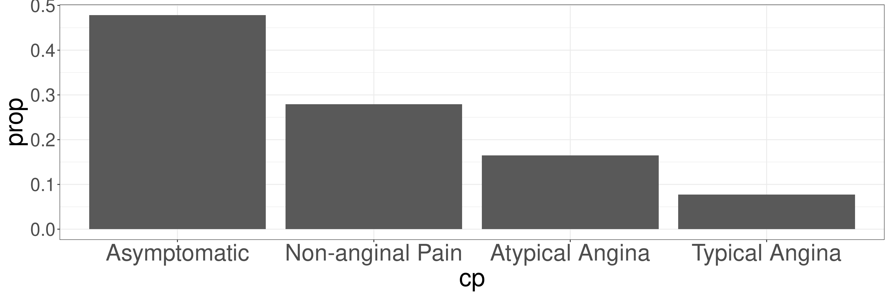
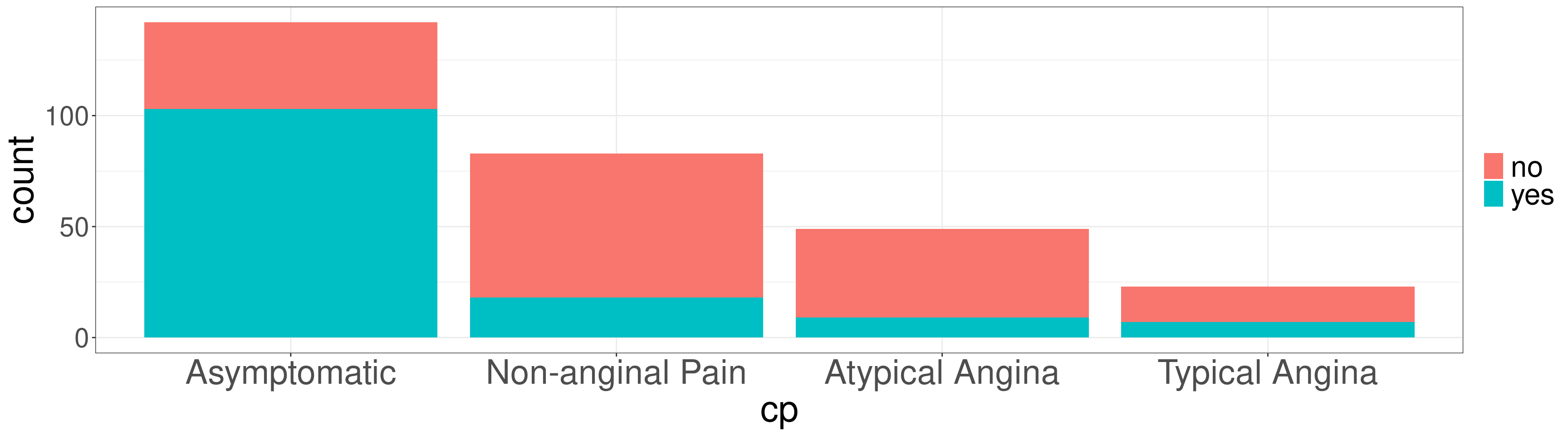
The variable cp indicates the type of chest pain.
Bar Plots
Heart Disease
Categorical Data
Continguency Tables
Bar Plots
Cross-Tabulation
Pie Charts
Theming
Plotting in R
Plotting in R can be done via the ggplot2, a powerful library based on the Grammar of Graphics.
Plotting in R
- You need to create a base plot using the
ggplot() - Use the
+to change the look of the base plot - Indicate how to transform the base plot to the desired plot
geom_*stat_*
- Change the look of the plot with other functions
- Use a
theme_*function to add a theme to the plot
Bar Plots
Bar Plots can be used to display the frequency or proportions on the data.
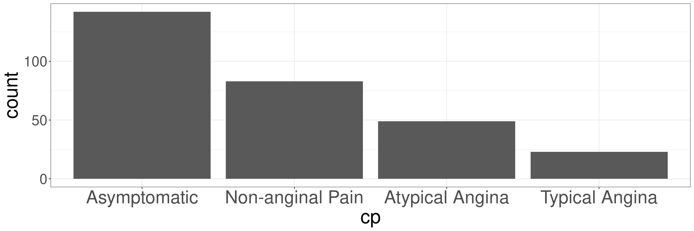
Frequency Bar Plots in R
DATA: Name of the data frame (eg:heart_disease)VAR: Name of the variable to create a plot (eg:cp)
Frequency Bar Plots in R
Relative Frequency Bar Plots in R
DATA: Name of the data frame (eg:heart_disease)VAR: Name of the variable to create a plot (eg:cp)
Relative Frequency Bar Plots in R
Cross-Tabulation
Heart Disease
Categorical Data
Continguency Tables
Bar Plots
Cross-Tabulation
Pie Charts
Theming
Data
The variable disease indicates if a patient has heart disease.
Cross-Tabulation
Cross-tabulations, also known as contingency tables, are statistical tools used to analyze the relationship between two or more categorical variables by displaying their frequency distribution in a table format. Each cell in the table represents the count or frequency of observations that fall into a particular combination of categories for the variables.
Key Features of Cross-Tabulations
- Rows and Columns:
- Rows represent the categories of one variable.
- Columns represent the categories of another variable.
- Cells:
- Each cell displays the frequency or count of data points that belong to the intersection of a row and column category.
Cross-Tabulations in R
DATA: Name of the data frame (eg:heart_disease)VAR1: Name of the first variable to create the cross-tab (eg:cp)VAR2: Name of the second variable to create the cross-tab (eg:disease)
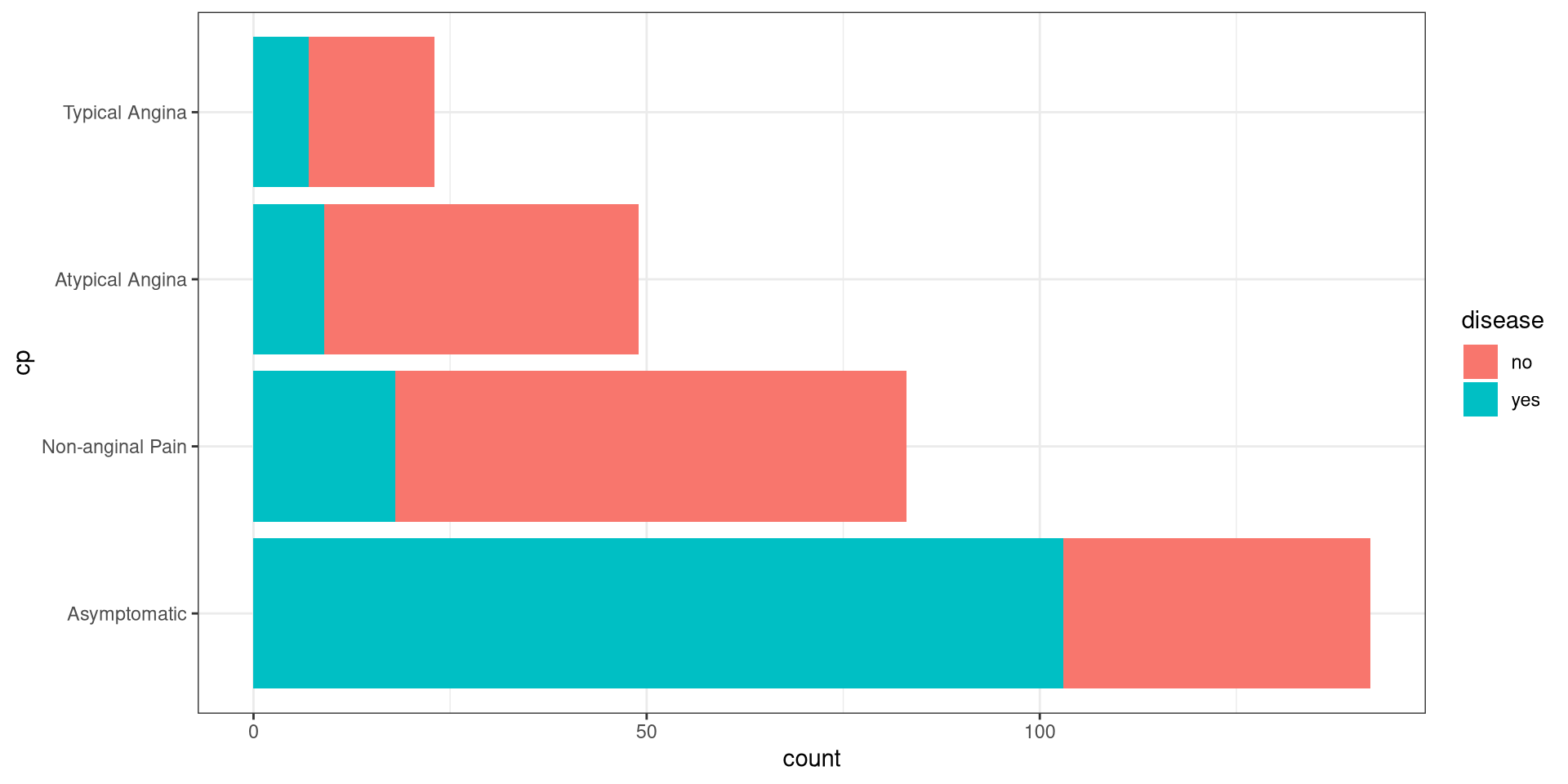
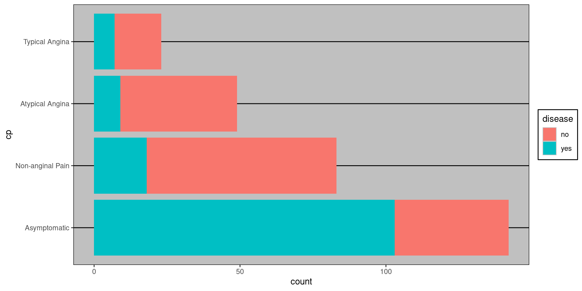
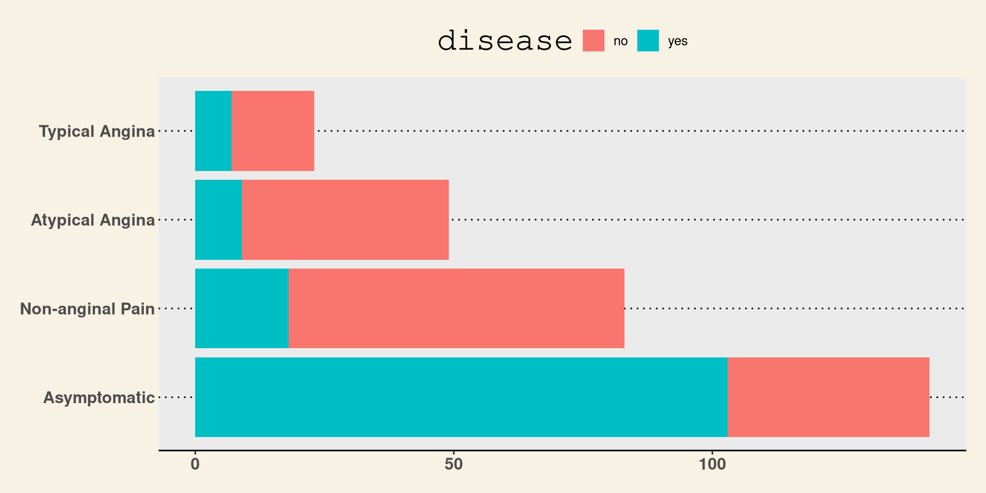
Cross-Tabs Example
#> Continguency Table
#>
#> Column Variable: heart_disease$disease
#> Row Variable: heart_disease$cp
#> $frequency
#>
#> no yes
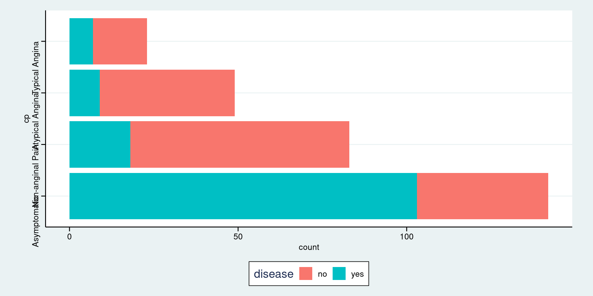
#> Asymptomatic 39 103
#> Non-anginal Pain 65 18
#> Atypical Angina 40 9
#> Typical Angina 16 7
#>
#> $table_prop
#>
#> no yes
#> Asymptomatic 0.1313 0.3468
#> Non-anginal Pain 0.2189 0.0606
#> Atypical Angina 0.1347 0.0303
#> Typical Angina 0.0539 0.0236
#>
#> $row_prop
#>
#> no yes
#> Asymptomatic 0.2746 0.7254
#> Non-anginal Pain 0.7831 0.2169
#> Atypical Angina 0.8163 0.1837
#> Typical Angina 0.6957 0.3043
#>
#> $col_prop
#>
#> no yes
#> Asymptomatic 0.2438 0.7518
#> Non-anginal Pain 0.4062 0.1314
#> Atypical Angina 0.2500 0.0657
#> Typical Angina 0.1000 0.0511Types of Props in Cross-Tabs
- Row Proportions: Show the percentage of each row total represented by a cell.
- Column Proportions: Show the percentage of each column total represented by a cell.
- Table Proportions: Show the percentage of the overall total represented by a cell.
Table Proportions
Table proportions in cross-tabulations refer to the relative frequency or percentage of counts within the entire table, calculated by dividing each cell’s count by the total sum of all counts in the table. These proportions allow you to examine the contribution of each cell to the overall data set.
Table Proportions
#> Continguency Table
#>
#> Column Variable: heart_disease$disease
#> Row Variable: heart_disease$cp
#> $frequency
#>
#> no yes
#> Asymptomatic 39 103
#> Non-anginal Pain 65 18
#> Atypical Angina 40 9
#> Typical Angina 16 7
#>
#> $table_prop
#>
#> no yes
#> Asymptomatic 0.1313 0.3468
#> Non-anginal Pain 0.2189 0.0606
#> Atypical Angina 0.1347 0.0303
#> Typical Angina 0.0539 0.0236Row Proportions
Row proportions refer to the relative frequency or percentage of counts within each row of a contingency table. In a cross-tabulation, row proportions allow you to compare how the distribution of one variable varies within each category of another variable, within a row.
Row Proportions
#> Continguency Table
#>
#> Column Variable: heart_disease$disease
#> Row Variable: heart_disease$cp
#> $frequency
#>
#> no yes
#> Asymptomatic 39 103
#> Non-anginal Pain 65 18
#> Atypical Angina 40 9
#> Typical Angina 16 7
#>
#> $row_prop
#>
#> no yes
#> Asymptomatic 0.2746 0.7254
#> Non-anginal Pain 0.7831 0.2169
#> Atypical Angina 0.8163 0.1837
#> Typical Angina 0.6957 0.3043Column Proportions
Column proportions refer to the relative frequency or percentage of counts within each column of a contingency table. These proportions allow you to compare how the distribution of one variable varies across different categories of another variable, within a column.
Column Proportions
#> Continguency Table
#>
#> Column Variable: heart_disease$disease
#> Row Variable: heart_disease$cp
#> $frequency
#>
#> no yes
#> Asymptomatic 39 103
#> Non-anginal Pain 65 18
#> Atypical Angina 40 9
#> Typical Angina 16 7
#>
#> $col_prop
#>
#> no yes
#> Asymptomatic 0.2438 0.7518
#> Non-anginal Pain 0.4062 0.1314
#> Atypical Angina 0.2500 0.0657
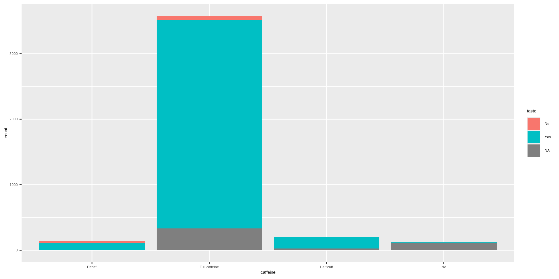
#> Typical Angina 0.1000 0.0511Stacked Bar Plot in R
OR
DATA: Name of the data frame (eg:heart_disease)VAR1: Name of the first variable to create the cross-tab (eg:cp)VAR2: Name of the second variable to create the cross-tab (eg:disease)
Stacked Bar Plot in R
Stacked Bar Plot in R
Pie Charts
Heart Disease
Categorical Data
Continguency Tables
Bar Plots
Cross-Tabulation
Pie Charts
Theming
Pie Charts
A pie chart is a circular statistical graphic divided into slices, where each slice represents a proportion or percentage of the whole. The size of each slice is proportional to the relative frequency or magnitude of the category it represents.
Pie Charts
Key Features of Pie Charts
- Circular Format:
- The chart is shaped like a circle, symbolizing a whole (100% or 1).
- Slices:
- Each slice corresponds to a category and its size represents the contribution of that category to the total.
- Labels:
- Slices are often labeled with the category name and the percentage or value they represent.
Pie Chart in R
DATA: Name of the data frame (eg:heart_disease)VAR: Name of the variable to create a plot (eg:cp)
Pie Chart in R
Theming
Heart Disease
Categorical Data
Continguency Tables
Bar Plots
Cross-Tabulation
Pie Charts
Theming
Themes
The R package ggthemes allows you to change the overall look of a plot.
All you need to do is add the theme to the plot.
Installing Themes in R
Install once on your computer or new session in google colab:
Then, load libraries:
Black and White Theme
Excel Theme
WSJ Theme
Stata Theme