#> [1] 181 186 195 193 190 181 195Numerical Data
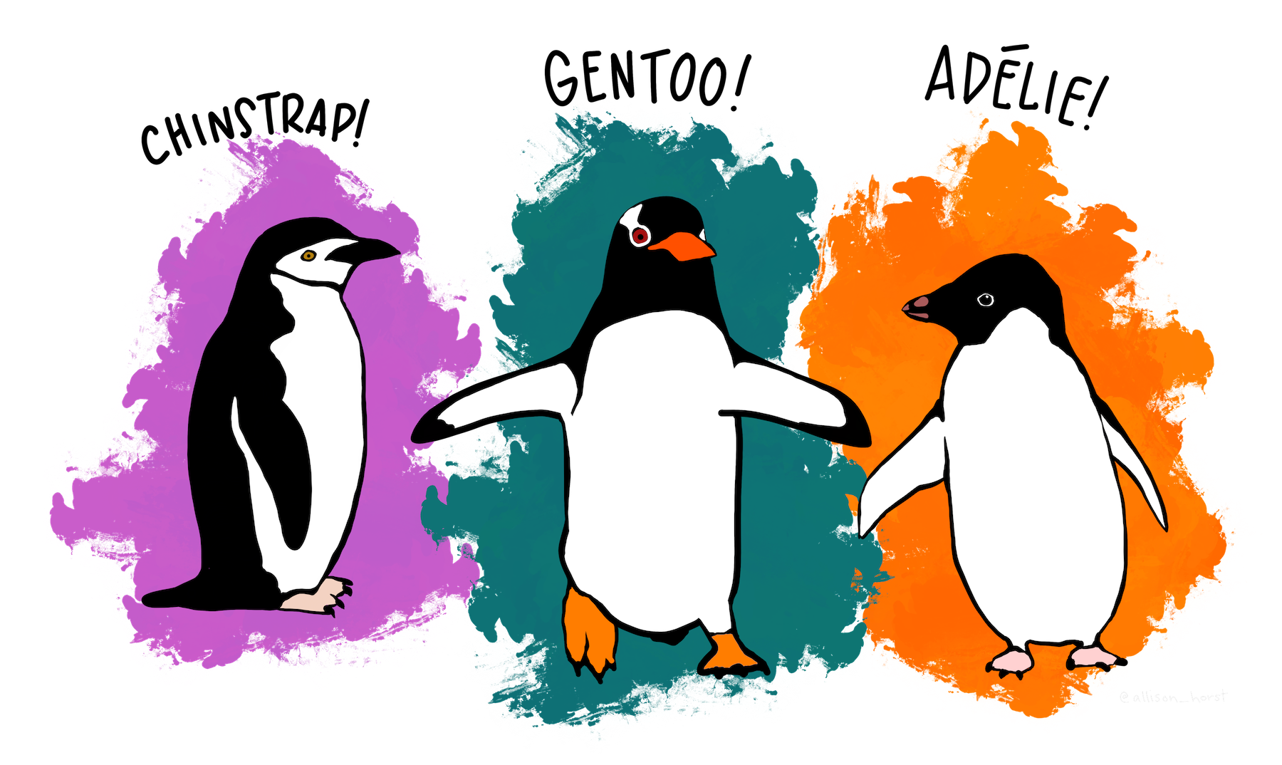
Palmer Penguins
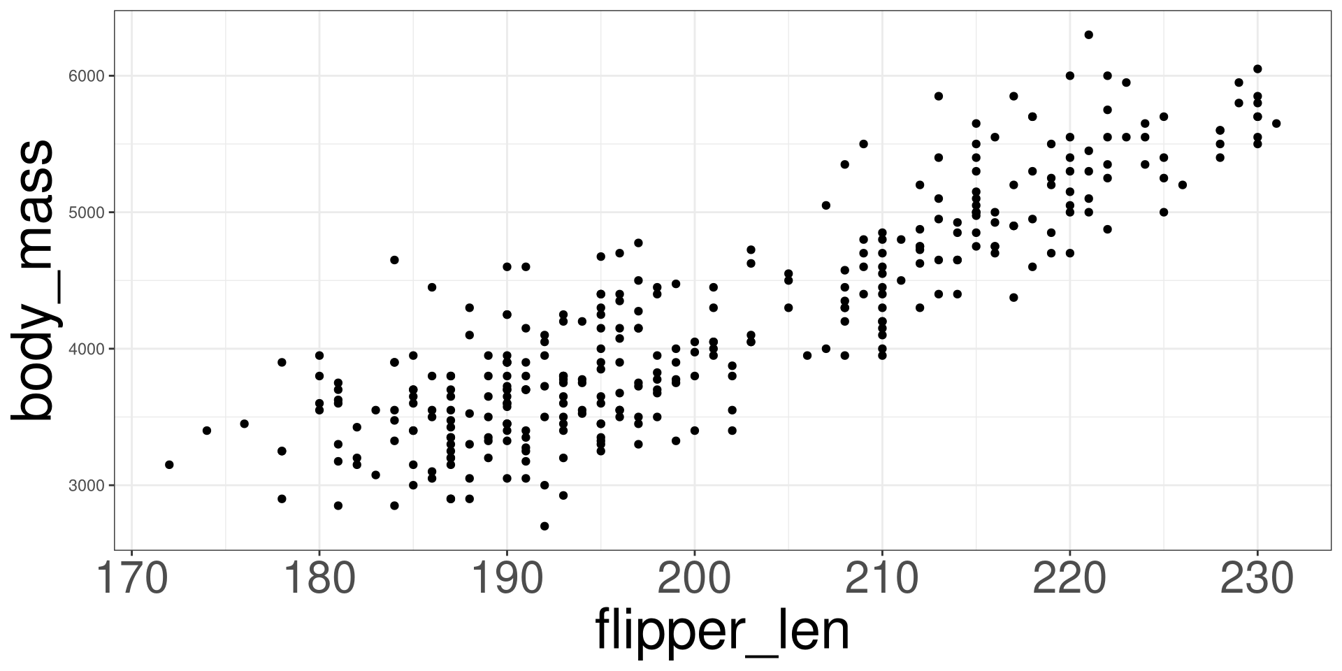
The penguins data set was contains information on penguins from the Palmer Station located in Antartica. You can learn more about the data set here.
Quartiles
Quartiles are three values (Q1, Q2, Q3) that divides the data into four subsets.
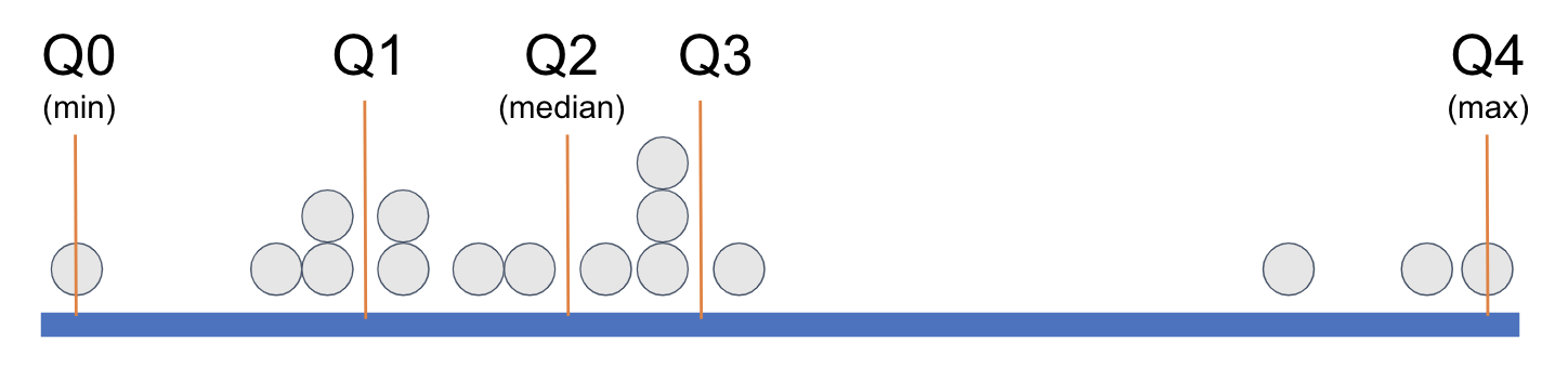
Q1
Q1 is the value signifying that a quarter of the data (25%) is lower than it.
Q2 - Median (\(\tilde{x}\))
Q2 is the value signifying that half of the data (50%) is below it.
The median also represents the central tendency of the data.
Q3
Q3 is the value signifying that 3 quarters (75%) of the data is below it.
Interquartile Range
\[ IQR = Q_3 - Q_1 \]

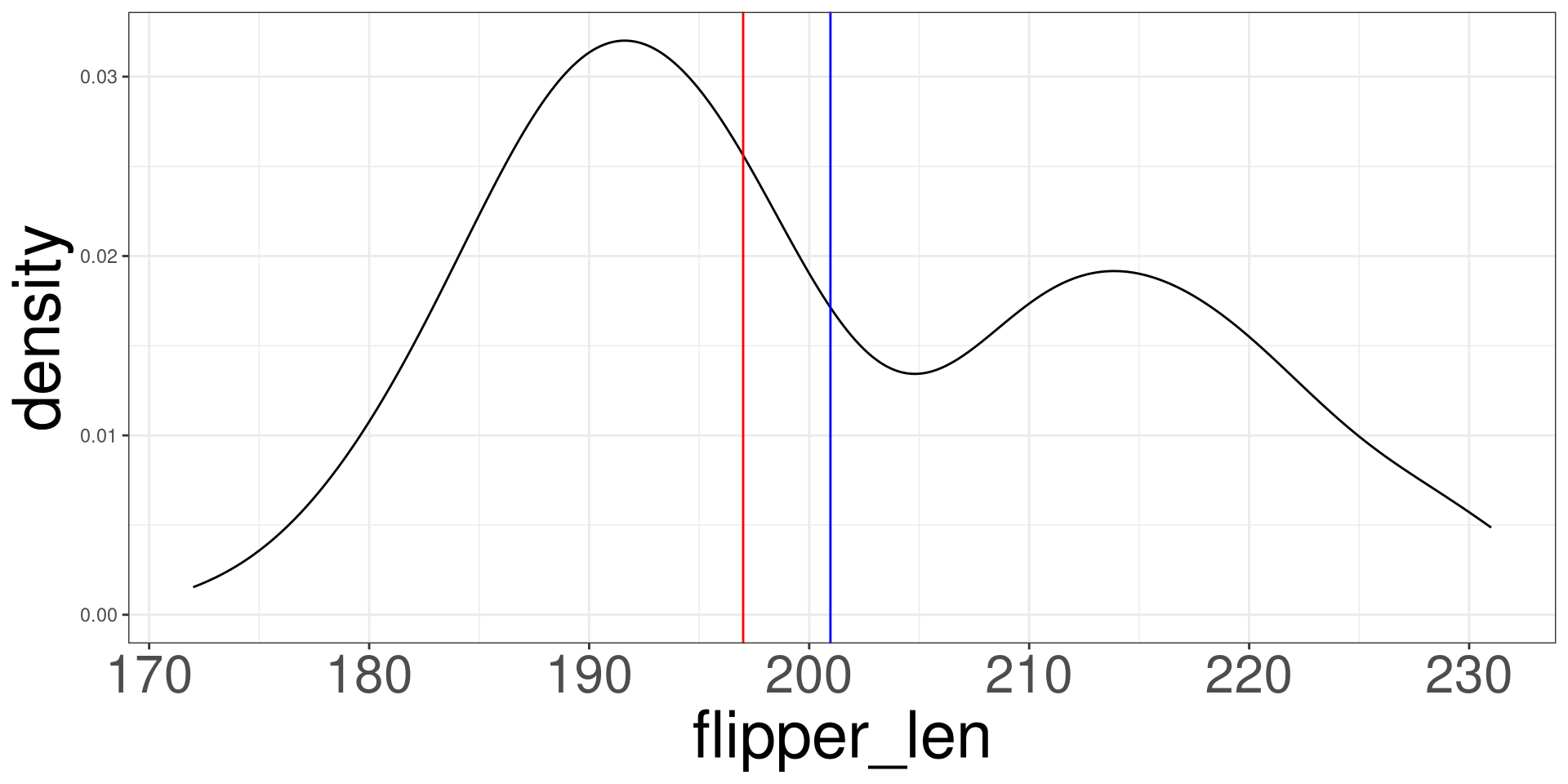
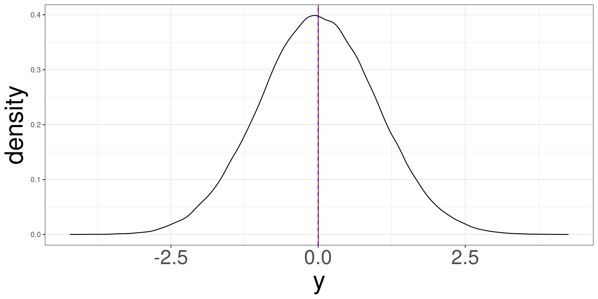
Mean vs Median
Mean (blue line) vs Median (red line)
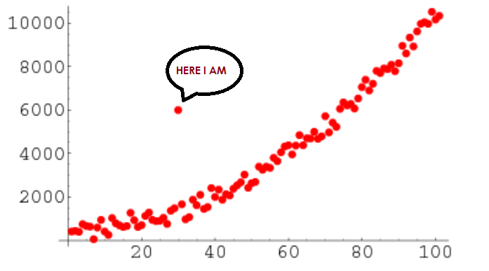
Outliers
These are data points that seem to be highly distant from all other variables.
Histogram
Histogram
Histograms
Histograms
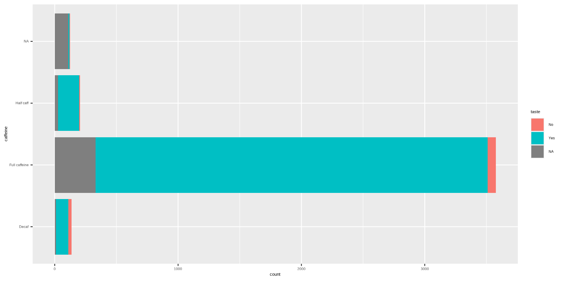
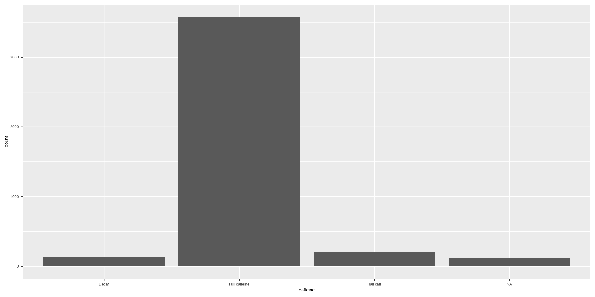
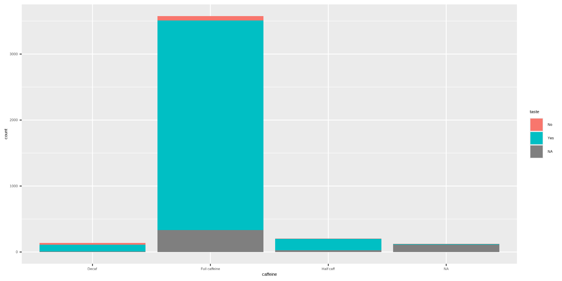
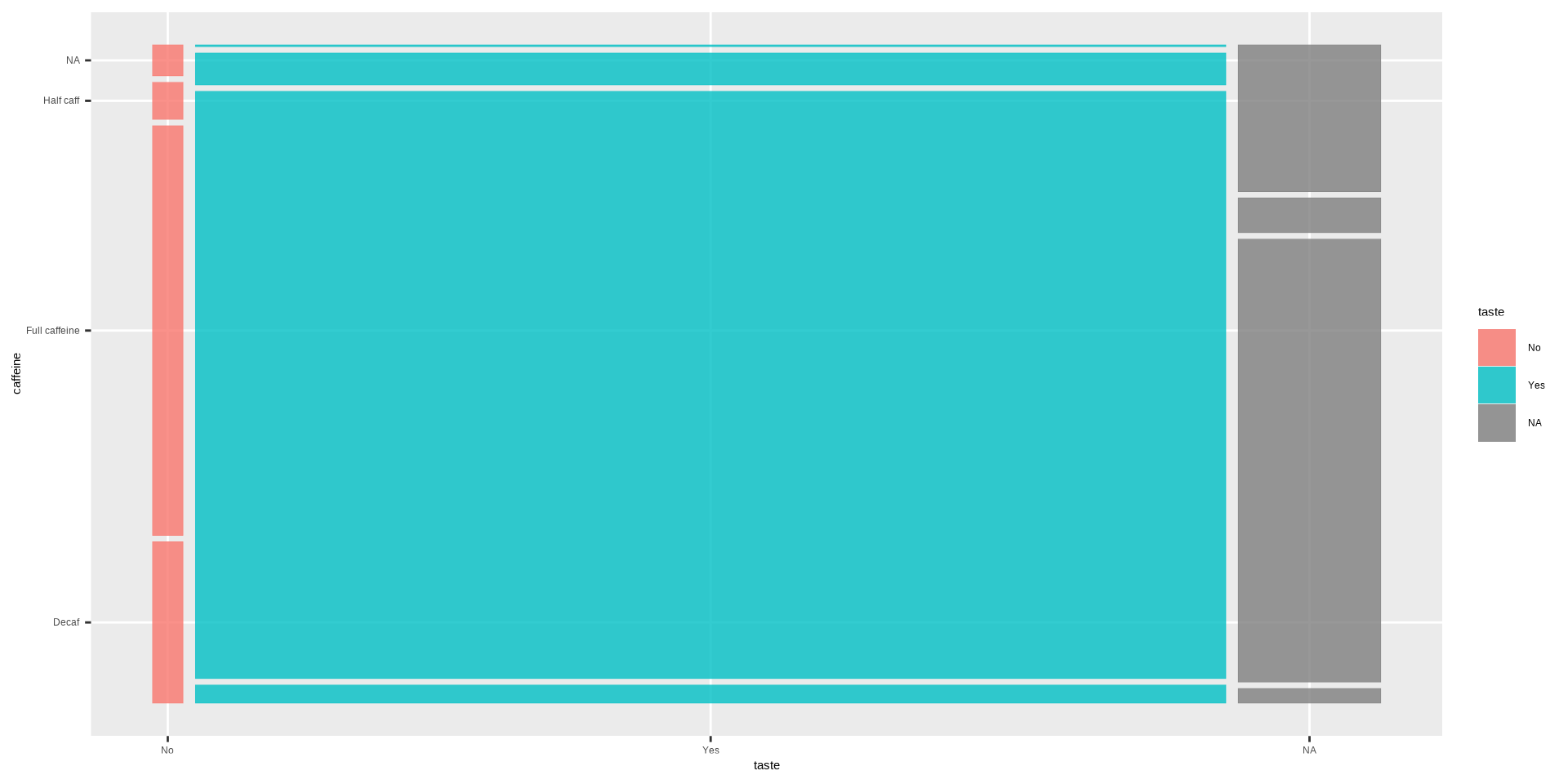
Penguins
Box Plot
Box Plot
Box Plot
Dot Plots
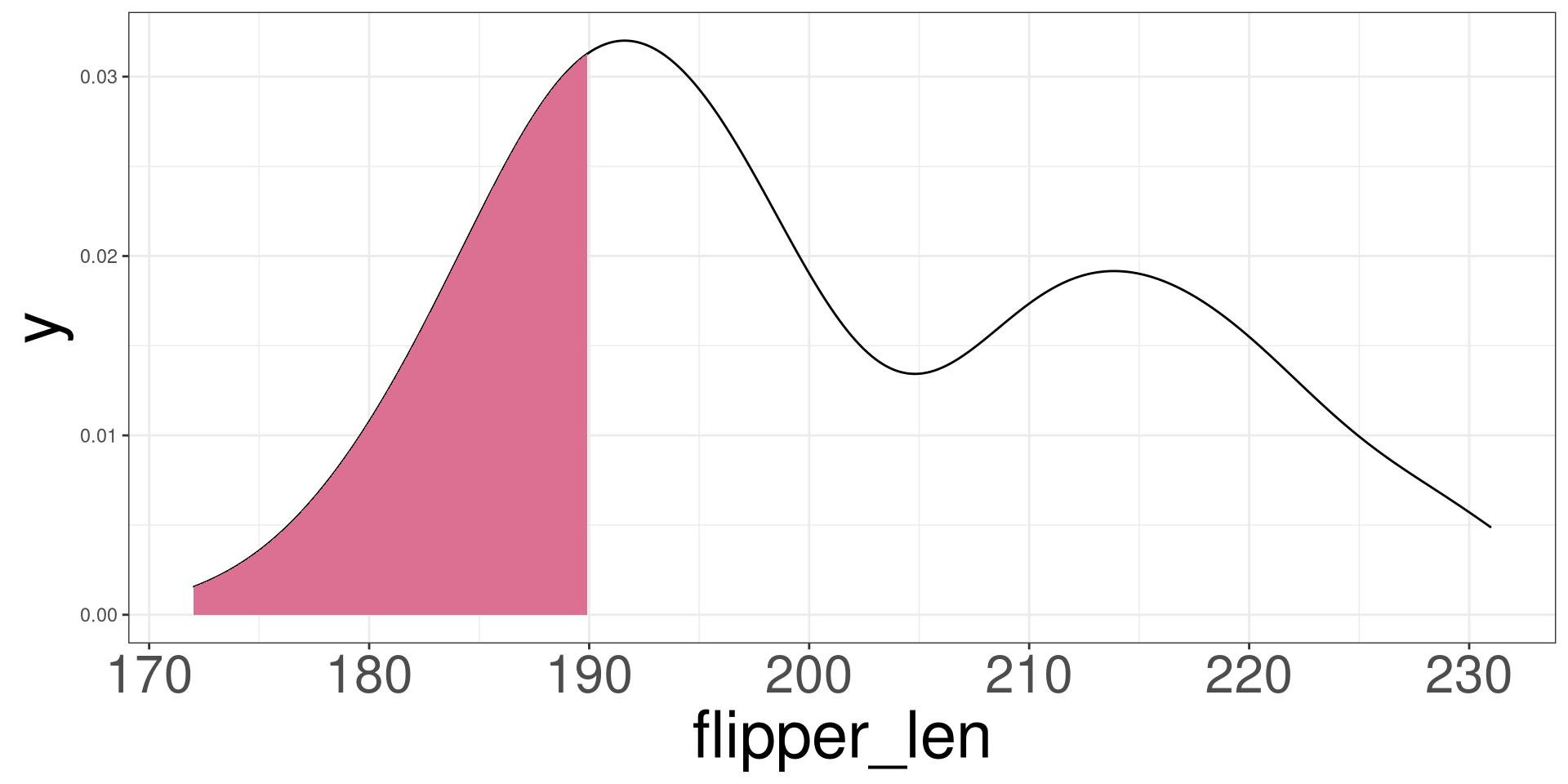
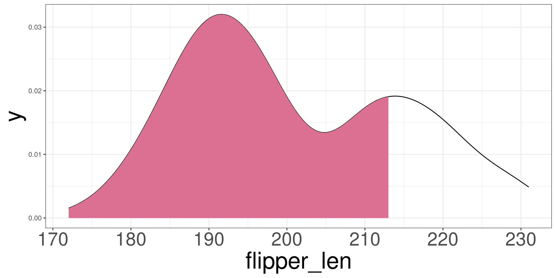
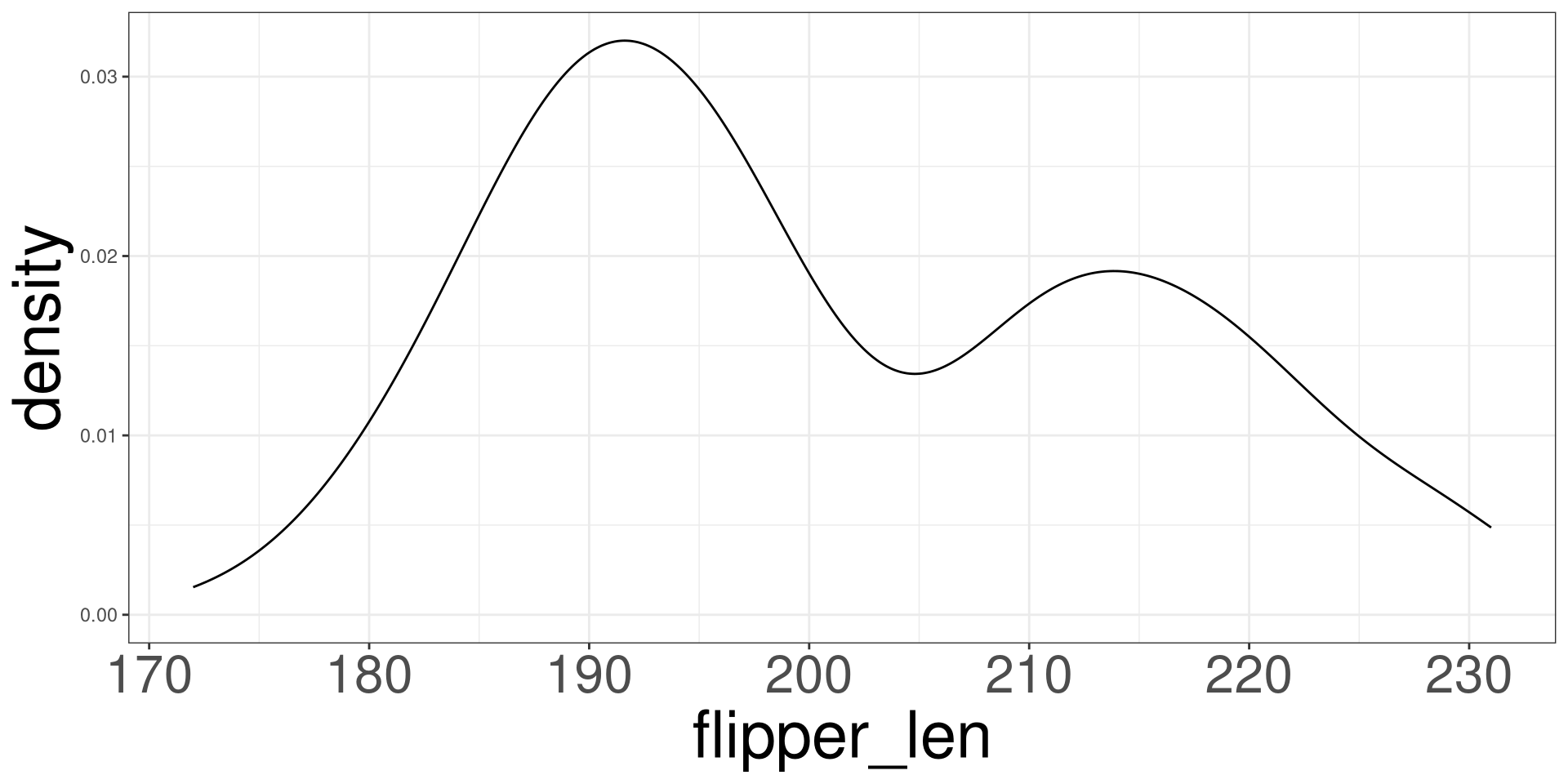
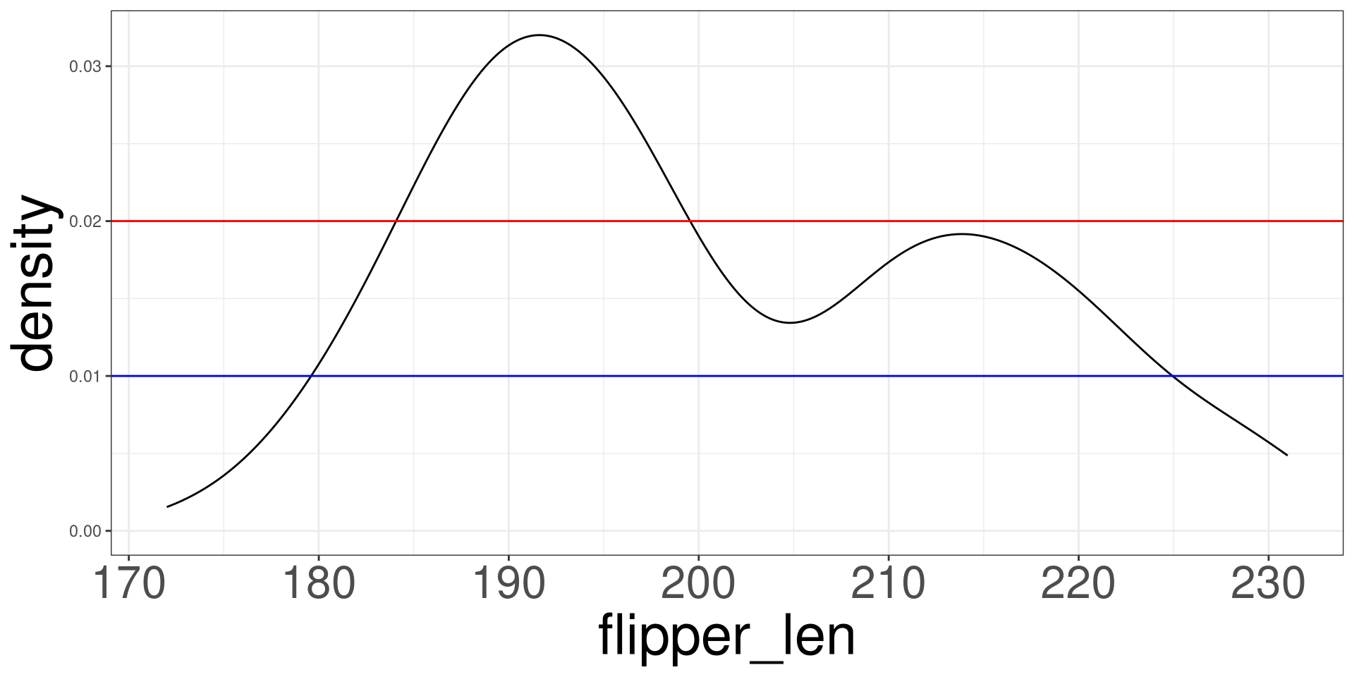
Density Plot
Vertical Lines

Horizontal Lines
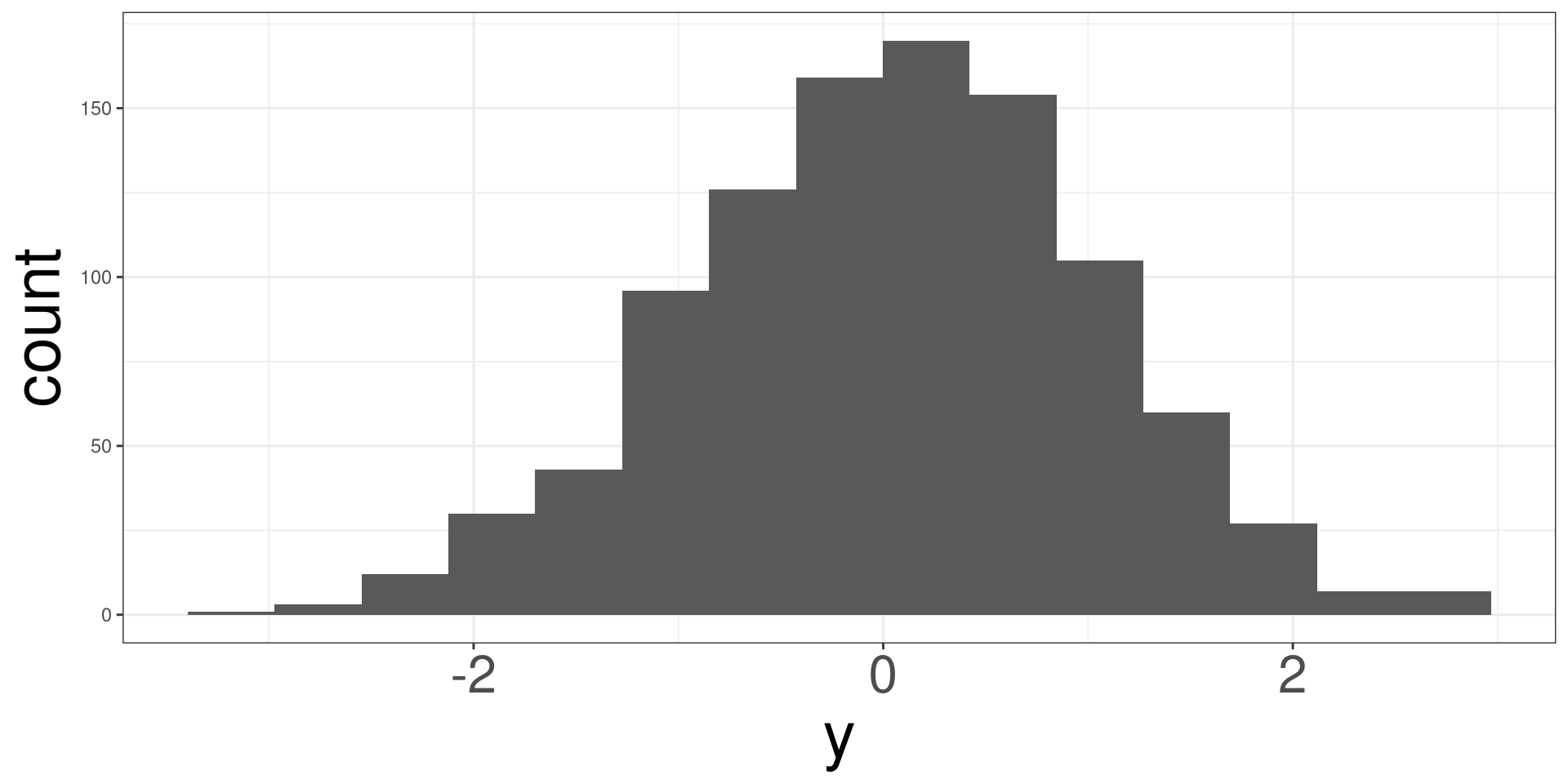
Symmetric Distribution
A symmetric distribution will look bell shaped and the mean (red line) and median (dashed blue line) will overlap each other.
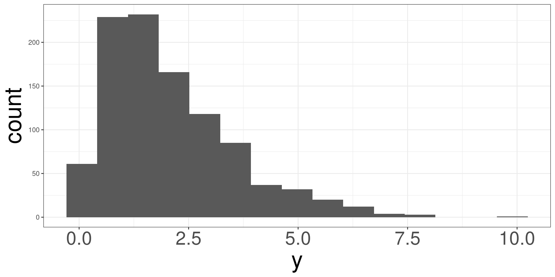
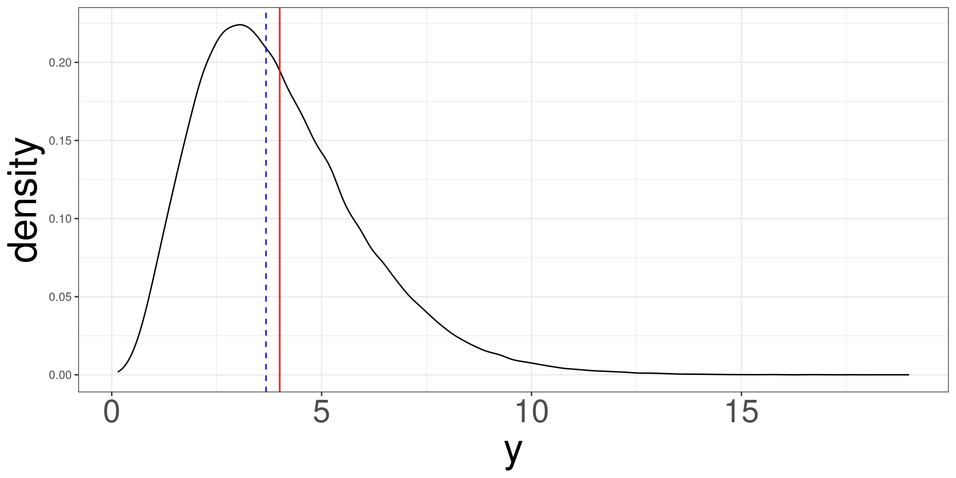
Right Skewed Distribution
A right skewed distribution looks asymetric and the mean (red line) is to the right of the median (dashed blue line).
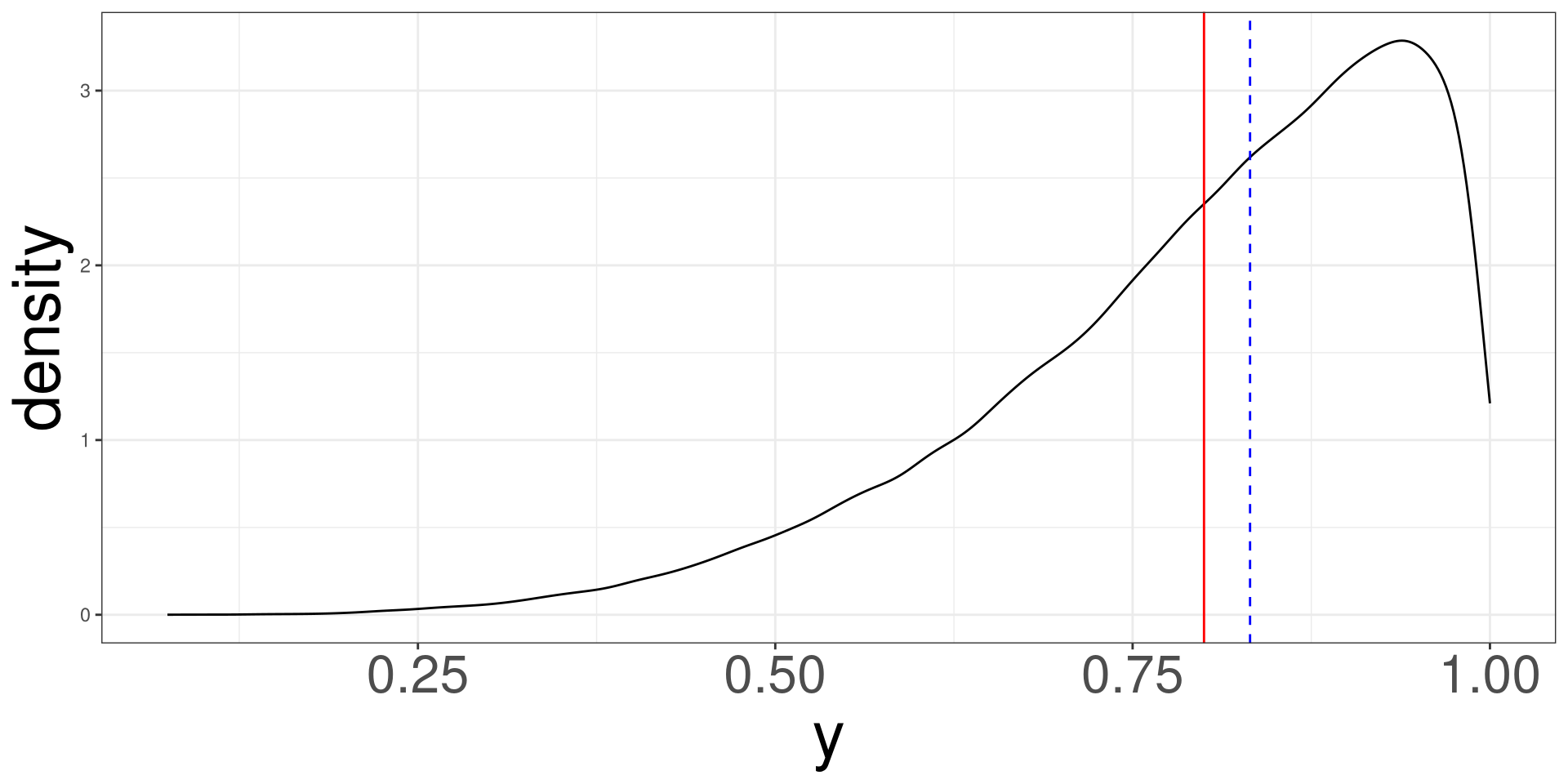
left Skewed Distribution
A left skewed distribution looks asymetric and the mean (red line) is to the left of the median (dashed blue line).
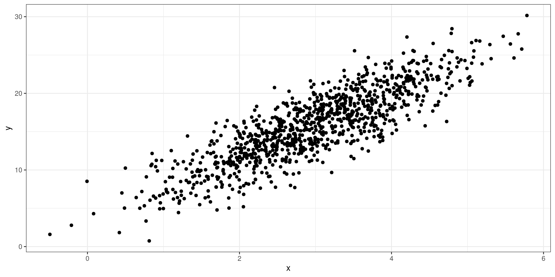
Positive Relationship
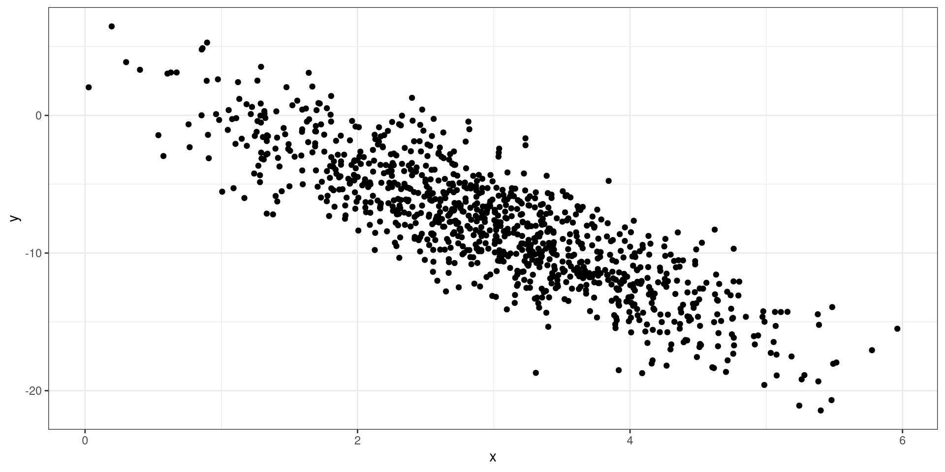
Negative Relationship
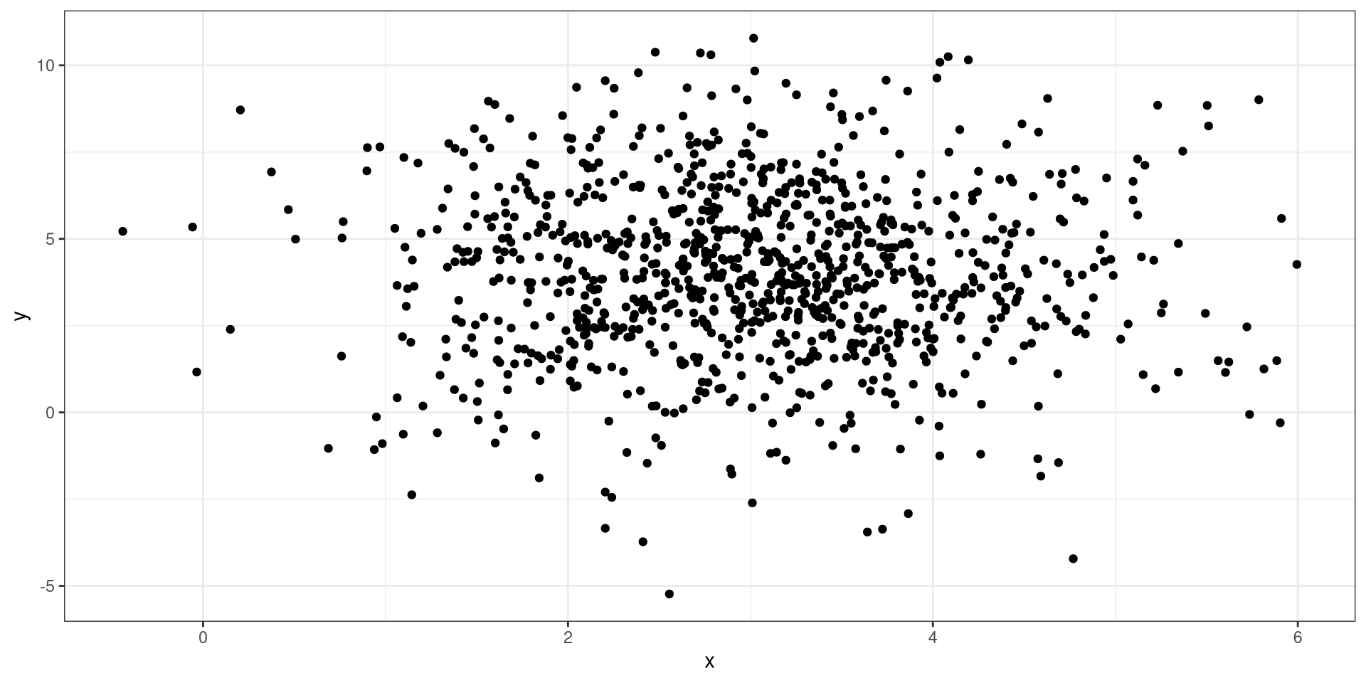
No Relationship
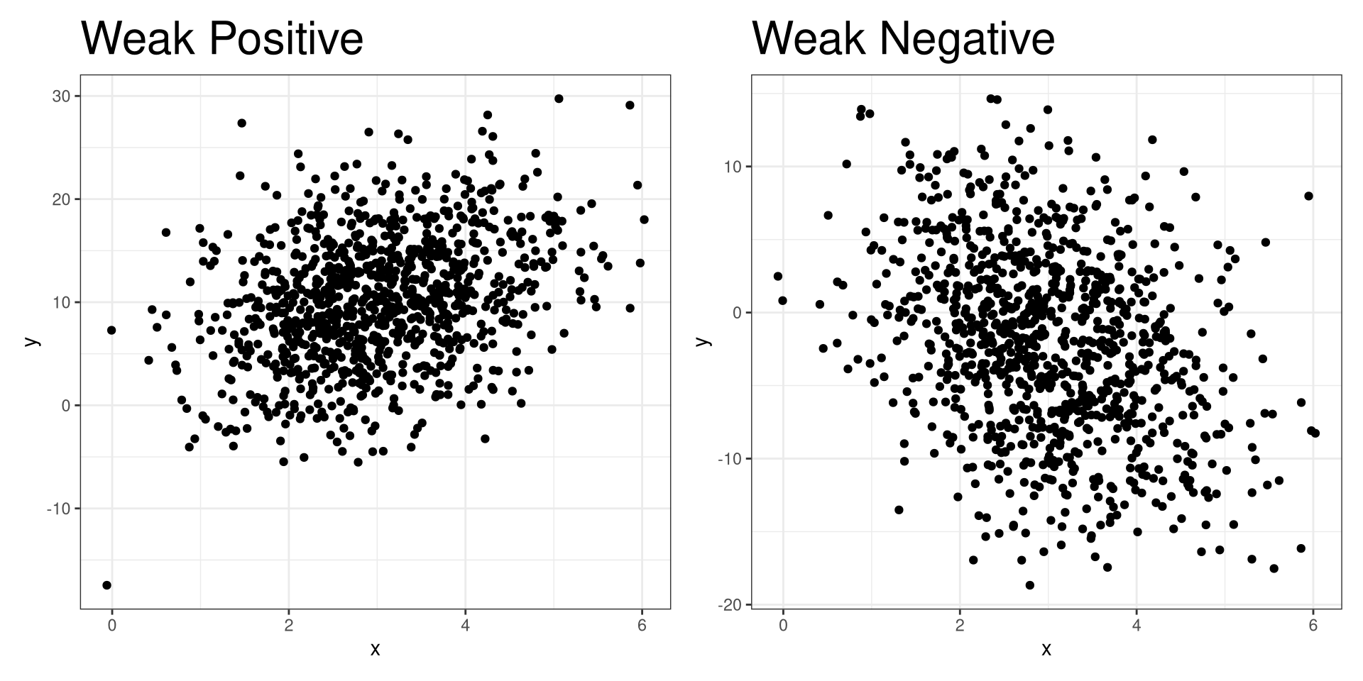
Weak Relationship
Penguins